Category: Assignment #4

  • Assignment 4 – Question 3

    Visit the St. Clair College website. Analyze it strictly from a visual marketing strategy perspective targeting:

    Local domestic high school students.

    You are to provide three strategic visual enhancement recommendations. For each recommendation:

    1. Homepage hero section (reference image):
    1. Full time programs page (reference image):
    1. Open house page (reference image):

    a) Clearly identify the issue or missed opportunity (3 x 2 = 6 Marks)

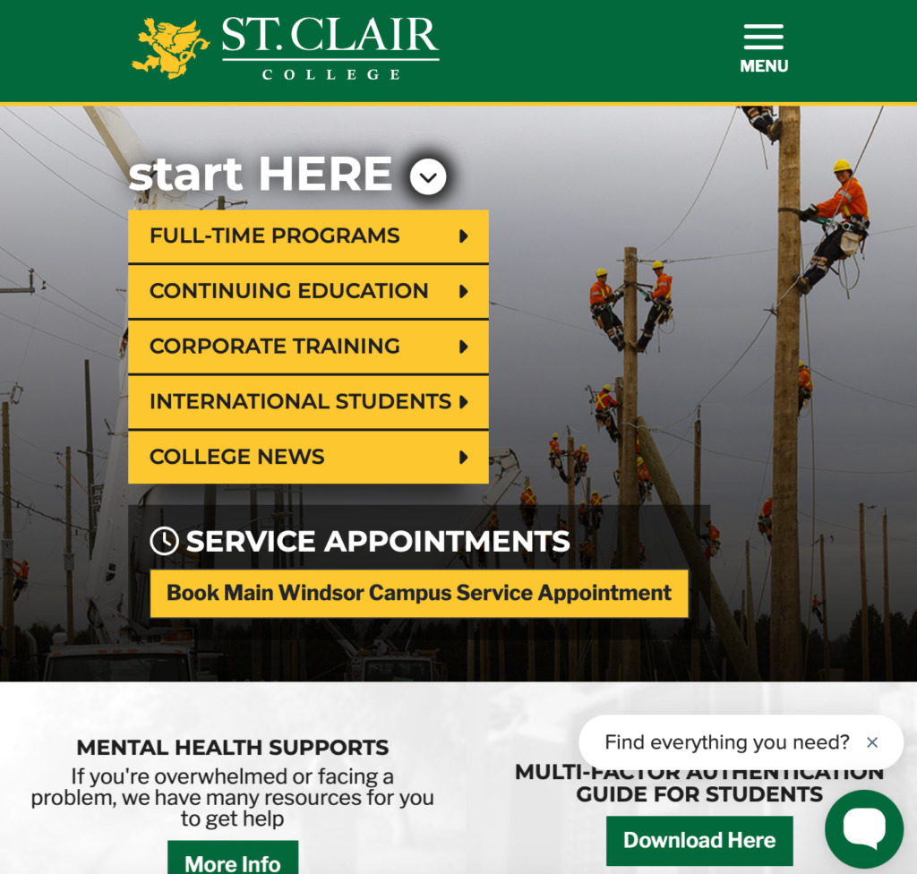
    1. Homepage hero section: the homepage hero section includes heavy content such as the start here and rotates between announcements but the visuals are overwhelmed by the amount of content. They don’t immediately reflect things such as students or campus life. There’s no clear emotional hook for someone landing on the page for the first time. It almost does the opposite because the writing doesn’t follow a pattern but instead it’s everywhere. 
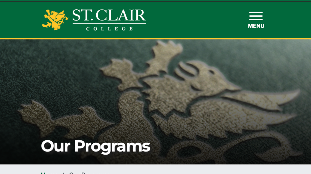
    1. Full time programs page: this page consists mainly of a long list of programs with no visual support besides the top hero section. It makes it hard and overwhelming to understand for high school students who may not even know what they’re looking at. It forces you to go slow and scroll up and down multiple times because it’s easy to get lost in a list. 
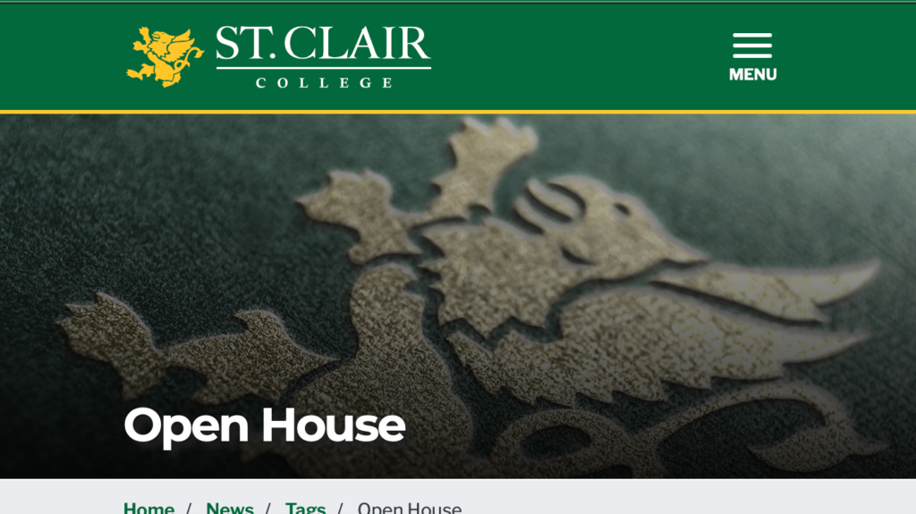
    1. Open house page: this acts as an article page, the visuals are limited using a few static photos that seem to just exist to fill space placed between large blocks of text. They include students walking and some talking to faculty without mentioning the quality of the images aren’t top quality but more phone and no attention to any editing or lighting. They document the event but don’t necessarily help the user in seeing the value in experiencing what it would be like to attend this event.

    b) Propose a specific visual improvement (3 x 2 = 6 Marks)

    1. Homepage hero section: instead of using the rotating banner full of announcements, upload a full width video or a strong image of actual students on campus that someone such as a high school student can see themselves in. show things such as walking to class, hanging out, or being in an engaging learning environment. Keep text minimal and allow the visuals to lead. 
    1. Full time programs page: instead of using a list to present the programs, use a visual program card where each program has a picture that reflects what it would be about. As well as categories to put all relevant programs together such as “creative” “business” “health” etc…
    1. Open house page: the page could use an interactive or immersive visual format such as using a short introductory video at the top of the page to highlight key moments. As well as a scrollable image carousel showing different moments and faculty, tours, classrooms, students interacting. It should be placed before any text so it can be the first thing users see. 

    c) Explain why it would improve recruitment effectiveness (3 x 2 = 6 Marks)

    1. Homepage hero section: the hero section is very important because it affects first impressions and they can happen fast since they are processed a lot quicker than text. A big captivating image can instantly communicate what the experience will feel like for first time students instead of making them read to figure that out. 
    1. Full time programs page: this will make the page a lot easier to scan and understand because someone who’s only interested in health and science programs can easily find their way to those programs rather than having to scroll and possibly miss it because of the stacked format. Users can visually identify their interest which reduces effort and helps with overall site experience. 
    1. Open house page: the open house is all about experiencing campus life and using static images doesn’t fully communicate the energy and connections made. A visual video or sequence can show the environment in action and communicate the energy almost instantly by showing the atmosphere at the place and reduce the need to read long text content. It makes the content effective because again it helps the user experience the event without actually being there. 

    d) Connect it to student psychology and digital behaviour (3 x 2 = 6 Marks)

    1. Homepage hero section: since domestic students consist of mainly high school students they would be more likely to engage with something they see themselves in that would be more real and relatable. Seeing other students go through a similar stage of life as them will help them envision themselves there like they already belong. This will increase interest and encourage them to explore the site further more to see all the places they could belong in.
    1. Full time programs page: students, especially current generation, are visual and scan driven rather than read the content to understand because they can get overwhelmed by all the choices. Visuals make the decision process a lot faster and simplify decisions which can make the conversion process much quicker because students are getting led visually from one place to another without spending too much time looking and reading information. 
    1. Open house page: future students would want to know “What would it feel like being there?” and an immersive visual could help answer that question because it allows the person to imagine themselves at the event and most importantly feel confident in attending because now they know how to navigate around and what to look for. It will encourage actions such as applying or wanting to actually go and clicking book a tour. Ultimately increasing engagement and moving users closer to conversion. 

  • Assignment 4 – Question 2b

    Explain in detail how the image(s) strengthens the post from a digital marketing perspective.

    You may reference:

    • Attention economy

    • Scroll behavior

    • Visual hierarchy

    • Brand perception

    • Trust building

    • Emotional triggers

    • Information processing

    • Conversion influence

    Be analytical. This is not a design reflection. This is marketing reasoning.

    From a digital marketing perspective, the image sequence can enhance the post by aligning it with how users behave in the attention economy. The content must immediately communicate the message within the first 3 seconds because users are exposed to tons of information and make quick decisions about what to interact with. Visuals have a better effect on grabbing attention than text because they allow information to be processed a lot more quickly and efficiently. 

     From a scrolling behaviour perspective, there’s a natural stopping point created between the contrast of the first and last image. This can increase engagement and time spent on the page as a result from stopping to analyze the journey the content is portraying. The viewer is guided by the sequence structure without having to actually read. 

    The images create a clear visual hierarchy. The first image shows uncertainty, the second shows that it could be changed by taking control of the experience, and the last shows the confidence you can gain as a result. This sequence ensures that the message is communicated quickly and logically. 

    The images present the business as approachable and empowering in terms of brand perception by showing that customers can gain confidence in a self-directed studio environment. In addition to using high quality visuals to strengthen credibility since users often rely on images when assessing the brand. 

    The sequence also makes the content more memorable and compelling by using relatable emotional triggers such as discomfort and confidence which can tie into offering a clear benefit as a result of using Spotlite’s studios. 

    Lastly, the images affect conversion behaviours by lowering uncertainty. The sequence effectively communicates value and increases the possibility that users will act by showing the experience rather than describing it.

  • Assignment 4 – Question 2a

    Why did you choose the specific image(s)?

    Your explanation must include:

    a) Business relevance

    b) Target audience alignment

    c) Image intent

    d) Why this visual works better than alternative visual approaches

    The selected images show a progression from uncertainty to confidence through a visual storytelling sequence in a self-directed photography setting. The business strategy of Spotlite Photography prioritizes independent studio use where clients control their own experience which is directly related to this idea. In addition to showing the results of a photoshoot, the images also represent the emotional experience that goes along with it which is an important part of the service offered. 

    From a target audience perspective, the images make sense for young adults and students who might feel uncomfortable or nervous in front of the camera. This demographic responds well to emotional relatability and visual content. The images immediately establish a connection with the viewer by displaying a familiar sense of uneasiness followed by a confident result. Visuals are more effective at grabbing attention and communicating meaning quicker than text because they can be processed faster. 

    The images are meant to show transformation through control. The sequence showcases how interaction and comfort in the surrounding environment stimulate a sense of confidence because it doesn’t always come naturally. The images use body language, posture, and progression to express meaning instead of written content. This supports the idea that images can effectively convey emotion and tell a story without using lots of words. 

    While the images are not original client work and are royalty free, they were thoughtfully chosen to best represent the intended idea. One setback of using free images is that they may not accurately reflect the setting or brand specific experience a hundred percent. Nonetheless, the first priority was choosing images that can effectively communicate the message and emotional journey. This ensures that even if the visuals aren’t completely customized the main idea will still work. 

    The visual approach is more effective than alternatives such as a single image or text heavy post because it offers context and progression. While a single image can show quality, it’s unable to demonstrate change. Viewers can quickly understand the full experience through the sequence format without the need for written explanation.

  • Assignment 4 – Question 2

    Confidence is the Difference

  • Assignement 4 – Question 1

    Visuals are not decoration. They are communication tools. Provide three strategic reasons why visuals are essential to effective web content. For each reason:

    • Clearly explain the concept

    • Provide a real-world example (not generic statements)

    Marks are awarded for depth, not surface-level answers. (6 Marks)

    1. Visuals capture attention instantly:

    Visuals are extremely important because they can instantly grab users’ attention in a digital world where people have short attention spans and prefer to scan rather than read. Users can form impressions very almost immediately since the human brain analyzes visual information a lot quicker than words. 

    Also the majority of users only read about 28% of a webpage revealing that written content by itself is not enough to keep users interested (Briscoe, W9 – B – The Power of Visuals (W26).pdf, slide 7).

    Example:

    Using a photography business website it would be having a strong hero image of a photoshoot that can instantly communicate quality and style and inform the user about the business before they even read anything. This can be more effective than reading a paragraph describing a service because the user can immediately understand the brand visually. 

    1. Visuals improve memory and retention:

    Visuals improve how users understand and remember information by helping retain it in long term memory. Content is easier to understand and recall when it’s paired with meaningful visuals that describe the content.

    According to research, when images are used alongside text people remember a lot more information because it makes complex concepts more digestible and easier to break down (Briscoe, The Power of Visuals in Web Content (W26).pdf, slide 4).

    Example:

    Also based on photography but this can be demonstrated through a before and after photo comparison on a website to show editing quality. This can communicate value more effectively than using words to describe how good the business is at editing because it shows proof and makes it more memorable to potential customers. 

    1. Visuals drive engagement and user behaviour:

    Visual content significantly increases user engagement when compared to text only content which can result in more views and longer page times. Posts that have visuals receive 94% more engagement than without since they are more shareable and easier to consume (Briscoe, W9 – D – Enhancing Content (W26).pdf, slide 7).

    Visuals are essential for achieving business goals because they encourage people to explore, engage, and by end take action.

    Example:

    A photography business could include a blog post with a carousel of images from a photoshoot or display it as a portfolio to encourage users to scroll through multiple visuals. This would help increase the time spent on the page and make the user more likely to explore other pages or even book.